Aren’t timelines great?!
Anyone who has spoken with me will know that I am a huge fan of diagrams as a way of breaking down complex topics into easier to understand concepts. Over the past few months and years at $dayjob, I have produced a number of diagrams during the reporting phase of our internal testing. Over this post, Im going to focus on one particular type of diagram – the mighty timeline. Bear in mind that these timelines work well from both an offensive and defensive standpoint!
There are several key benefits to producing these timelines, in no particular order:
- It ensures that you fully understand the order in which activity occurred. For example:
- Do we know exactly where we obtained credentials X?
- Where did they attempt to use them?
- Do we know all of the hosts which a threat actor moved laterally onto?
- If you make this timeline during the live testing window, it serves as an excellent tool for deconfliction between red team activity and the blue team.
- These timelines can be given as part of an executive overview without having to dig into vast levels of detail and can help to visualise the stages of an attack
For context, my role at $dayjob is more of a white-team role, where I organise and co-ordinate red team testing – so I often have to do debriefs on the output of red team testing!
More Timelines!
For this post, I will be using the GDPR report into the British Airways hack. As a public document, we can use this to produce a potential timeline of the incident by reading between the lines of the content included in the report. I will emphasise that I have no idea on the detail behind the BA hack, all the detail in this post is from the ICO ruling. Any detail which is actually true is purely by coincidence (a.k.a. Please don’t sue me).
Throughout this, I will be using Draw.io which is a free alternative to Visio. If you have the option, I would recommend Visio as it does have some nice extra features.
Typically, I produce 4 diagrams for any complex red team engagement:
- Low-Level Diagram
- Medium-Level Diagram
- High-Level Diagram
- Defensive Improvement Opportunities
Low-Level Diagrams are typically shared with our trusted agents, or the defensive teams following any testing. High-level diagrams & ‘Defensive Improvement Opportunities’ diagrams are used extensively for stakeholder debriefs or in PowerPoint presentations. Medium-level diagrams tend not to be used all that much in my experience, but still have their place!
Low Level Diagrams
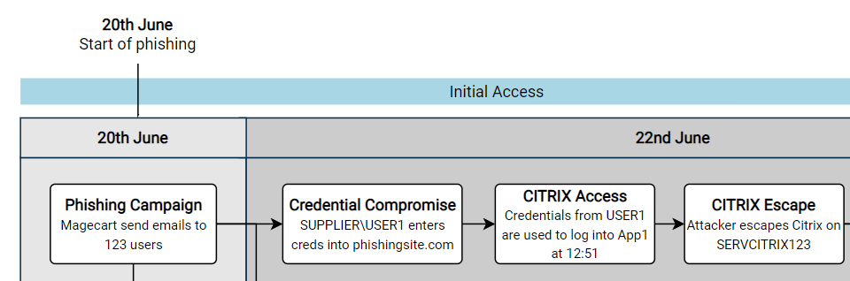
For these low level diagrams, I feel that there is basically no limit to how detailed they can be. From my experience, these are what I use on a day to day basis through the live testing period. These are eventually shared with the blue teams in order for them to learn from and to correlate any alerts and detections – so the more detail the better!
They also serve as an excellent tool for deconfliction, so I would recommend producing them as you go if at all possible. The process of making these diagrams often reveals any areas which you don’t fully understand, so you can clarify your knowledge with the red team lead before the reporting stage begins in anger.
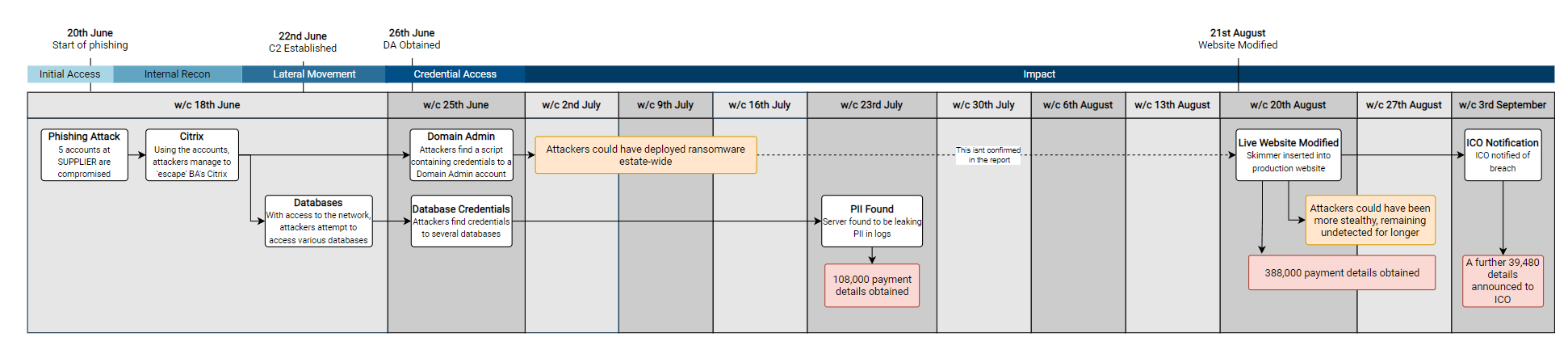
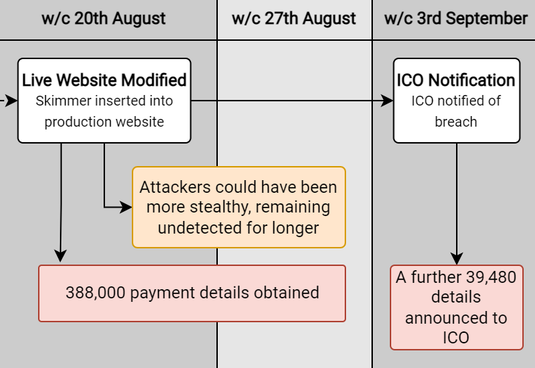
An example could be the following, focusing on the initial days of the attack on BA:
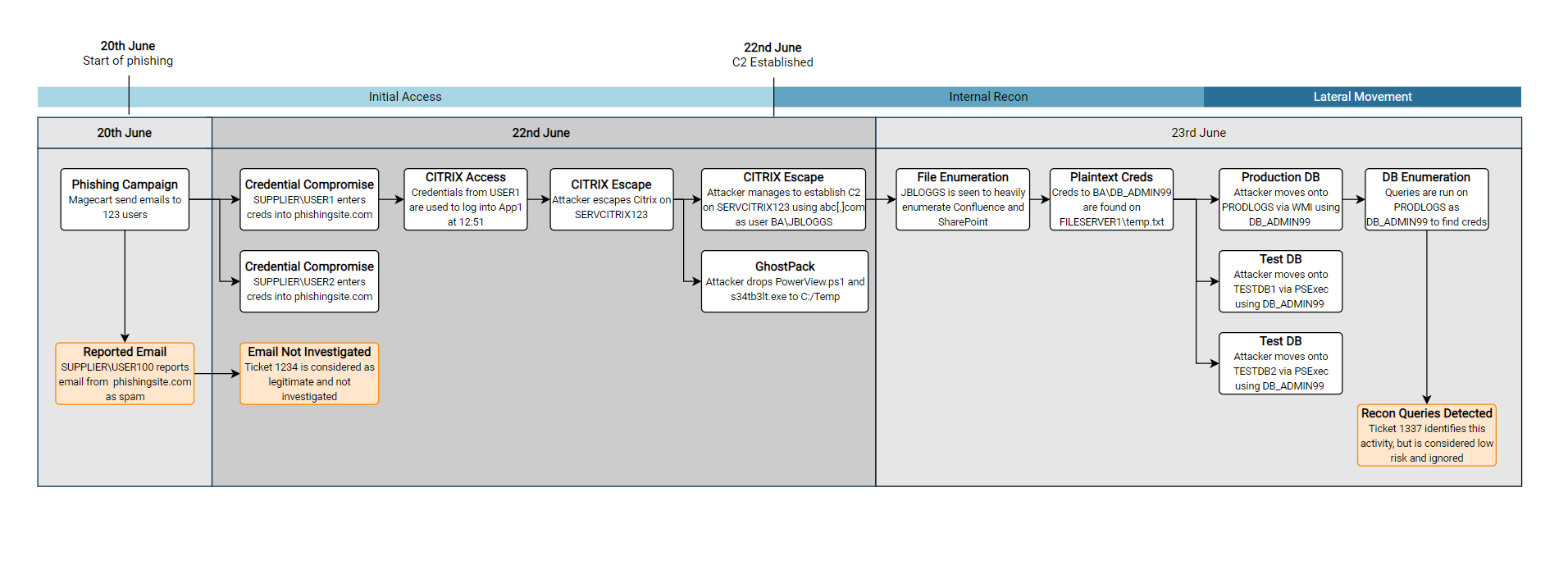
There are a few features of this diagram which I find have been useful, going from top to bottom in the diagram:
- Adding a few brief summaries of key points can help to draw attention to key events. I tend to keep these key milestones the same across all of the diagrams I produce, from the low-level to the high-level diagrams. This helps to highlight the key moments in what can sometimes be quite complex diagrams!
- A rough summary of the kill-chain steps can help to indicate what was happening at the given time.

- Again, splitting the background colours up into individual days will help to distinguish each days activities. I find this also helps to indicate how much activity occurred. For example, the 22nd was clearly a very busy day for Magecart in the diagram above.

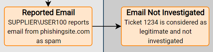
- Highlighting SOC tickets or other defensive actions can help to tell the story of any near misses, and show potential areas for improvement. Again, these are totally fictitious SOC tickets (Please don’t sue me)
High Level Diagrams
For these diagrams, I normally try to be quite succinct in the comments made on the diagram. As you’ll see below, there are far less boxes, and they contain less technical information. This is intentional, as this sort of high-level diagram is more likely going to be viewed by less technical stakeholders, who (unfortunately) wont care about the leet techniques used to gain initial access. This also has the added advantage that these diagrams will then tend to fit into a PowerPoint slide without having to be split up.
In order to maintain consistency, I have again included the key milestones and kill chain elements, and am instead using a scale of weeks instead of days.
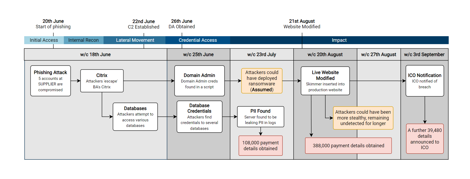
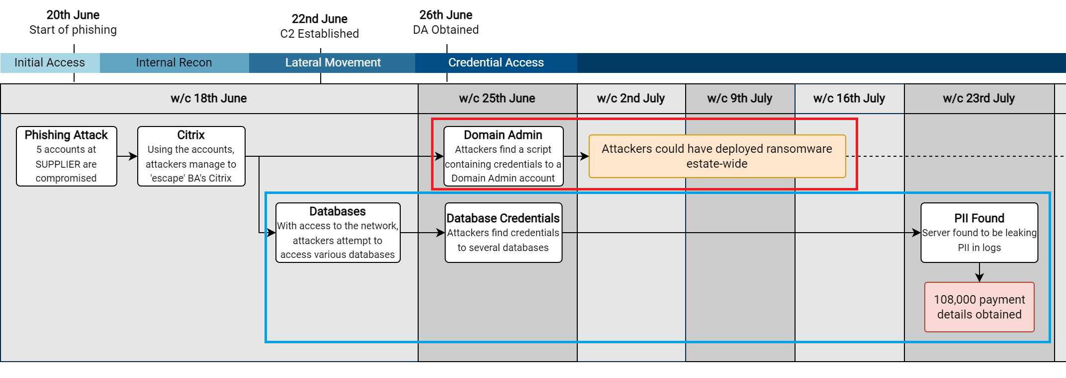
Another option which can be handy, is to create a diagram which includes every day (or week) for the time period which you are covering. For example, in the diagram above I deliberately didn’t include the 2nd, 9th or 16th July as there was no activity. In the diagram below I have included it, which can put highlight the length of dwell time between periods of activity.
From the below diagram, we can clearly see that there were two significant periods with no major activity – which highlights the length of time from initial access to detection.
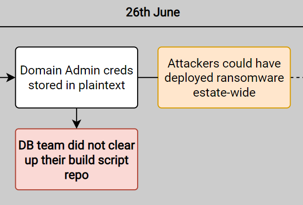
In prior tests, I have also taken this time to point out what could have happened during the red team exercise. For example, above I point out that ransomware could have been deployed – an action which would have likely been very damaging for BA’s estate (And arguably financially crippling compared to the GDPR fine they ended up with).
Whilst this is more relevant for tests where I operate as a white team lead, it can be useful to apply some business context to the findings. For example, adding a box to clarify potential business impacts which could have occurred:
- “With access as user X, testers could have compromised system ABC but decided on other targets”
- “System ABC was compromised, but testers used an alternate route to achieve Objective X”
Defensive Improvement Opportunities
The final ‘style’ of timeline diagram which I will cover is the ‘improvement opportunities‘ diagram. This has been a secret weapon of complex internal debriefs, where suggestions from a red team report can be mapped onto a timeline, showing the potential solutions to the key findings of a red team exercise.
Following the debrief of a test, the next logical question on most people’s mind is “How do we fix this?”. Therefore having a diagram which contains recommendations mapped to the testing timeline is a good starter for this conversation. If a particular event from testing draws a lot of attention, then it can help to direct the discussion. For example below, if the initial access was especially concerning to the audience, then there are 4 potential options which could be discussed to aid remediation (REC01, REC02, REC03, REC04).
Below is a snippet of what could have been produced for the initial stages of the BA report (With several fictitious additions from myself to make it a little more interesting)

The naming of this diagram is admittedly very woolly, but it is very much deliberate (And not me running out of ideas for new timelines). This slide typically will lead to a lot of ‘discussion’, and so it is best to ensure the language used remains neutral and simply presents the facts without any opinion. For example, instead of including a statement of ‘The entire Citrix team effectively have Domain Admin permissions’, I would instead simply suggest an AD permissions review to ensure I don’t see my P45 any sooner than I need to.
As you can see, splitting the findings into procedural and technical ‘improvement opportunities’ can help to distinguish between two common groups for these opportunities. Depending on the test, these groups might change – or you might find that splitting them into groups isn’t that much use!
I would also advise giving a unique reference to each suggestion (e.g. REC01, REC02…) , as it makes it far easier to discuss the suggestions and ensure that everyone is referring to the same item on the diagram! Additionally, it means that any actions or notes can be accurately taken – there’s nothing worse than having to second guess your notes after a debrief!
Timeline Guidelines
As you may have noticed from the diagrams above, I try to be quite consistent with how I lay them out and design them. I find that this consistency makes them easier to read, and means the audience can focus on the content rather than unusual layout or styling choices!
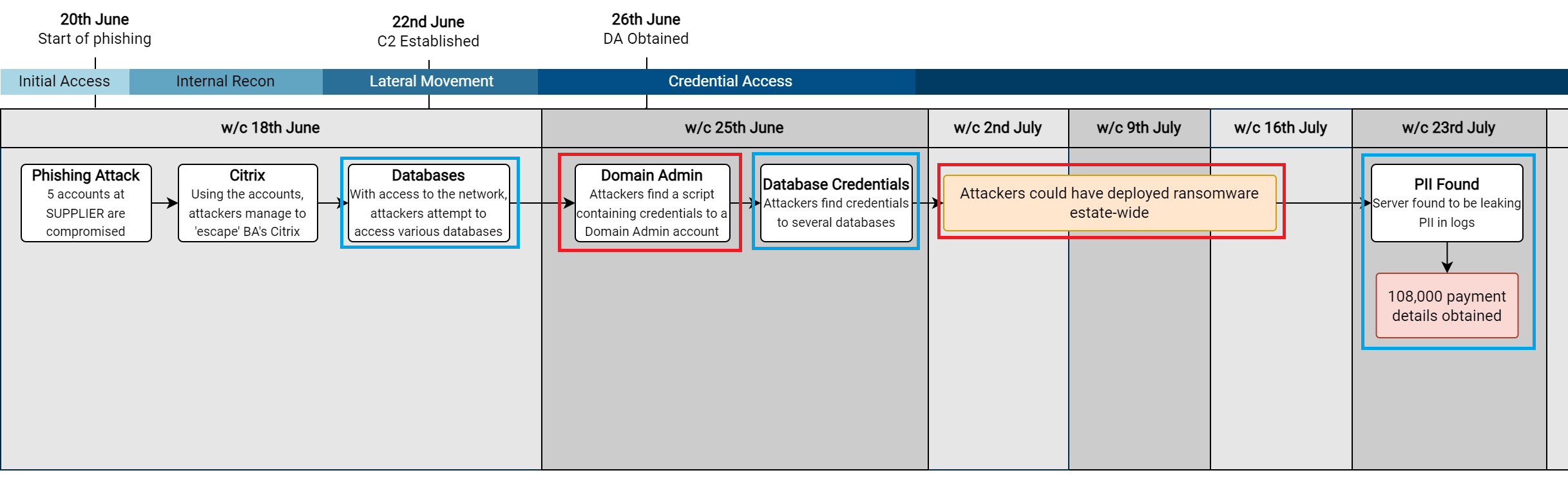
One of the most important things I find is to ensure the direction of the arrows makes logical sense when laying out a timeline. For example, in the high-level view below, I have highlighted the two ‘rows’ of events I created to show the two separate strands of activity:
- Red – The potential ransomware angle
- Blue – The eventual PII theft angle
This also makes it clear that both of these chains of events stem from the same initial point (Citrix compromise & break-out).
To show why I use these distinct ‘rows’, I have made another diagram below which only uses a single ‘row’ for the events.
This shows how the narrative behind a red team exercise (or incident) can quickly become confusing if we decide to do this, as it is hard to distinguish how each action was achieved. For example:
- Did we get Domain Admin privileges from a database server?
- Could ransomware have been deployed estate-wide from a database?
I try to use the same font across the entire diagram. In areas where I want to draw attention, I typically make the font bold and increase it by a font size or two. If you need to add more even more detail to an event, I typically just add it into a comment on the shape when I am using Visio – so that I can refer back to it later on. For example, below I make the title of the boxes bold, but keep the text the same size.
In terms of the colours to choose, I would be careful when using shades of red and green, as they have connotations of red being bad and green being good – which you might not want! I have found the following colours to work well for specific events:
| Colour | Usage |
| Dark Pink (Totally not red 😉 ) | Key attacker actions/objectives |
| Orange | Add context to attacker activity |
| Blue | Defender actions |
| Green | Key defensive actions |
Below is a snippet of the high-level view showing these colours:
Additionally, when it comes to debriefing tests, any red on a report can appear inflammatory to the teams which have to remediate the issue. For example, this would likely not make you many friends in a debrief:
Accessibility
Across all of these timelines, accessibility should be considered the whole time. Generally we want to make them as readable as possible, so ensuring we use a good size font is an obvious place to start, although this can be challenging on complex low-level diagrams which cover a wider timespan.
Additionally, colour-blindness does effect a lot of people, so I would avoid making red and green colours an integral part of the diagram. I tend to use colours to enhance key parts of the diagram, but a colourblind reader should also be able to glean the same information. To take this further, I have previously added a dashed border or patterned background to signify events of interest – as both colourblind and non-colourblind readers will be drawn to those items. This can start to look messy if you aren’t careful, so use it at your own risk!
Finally, try to make the diagrams as uncluttered as possible. Reading diagrams with large amounts of intricate detail and arrows is very difficult to understand (and boring), they can often be simplified, especially when included in a PowerPoint slide! Whilst this is of less concern for the low-level diagrams which contain all of the technical information, I try to always minimise the number of events included in a high-level diagram if at all possible.
Summary
Hopefully this post was of use, I truly think that well-designed diagrams and timelines are a real timesaver when it comes to reporting and debriefing a red team test. With some good thought and planning up-front, they can avoid a lot of confusion and generally lead to better outcomes when doing a debrief.