BloodHound & Cypher Language

In my previous post, I covered the basics of BloodHound. In this post I will dive into the Cypher query language but we will focus on using it from an assessment/auditing angle – rather than as an attacker. Being able to quantify and detail the issues which exist in a large AD estate is an extremely powerful way of reducing the internal attack surface, forcing attackers (or red teamers!) to become more noisy.

Additionally BloodHound can help to focus remediation efforts, instead of blindly trying to remediate hundreds of users with weak passwords, BloodHound can show the level of access that each account has. This data can be analysed to allow prioritised remediation to be performed on the most powerful accounts first, helping to better secure your environment much faster!

What is Neo4j?

As a brief explainer, BloodHound is a nice GUI which sits on top of a neo4j graphing engine. Neo4j uses the ‘Cypher‘ query language, which we can then use to directly query the raw AD data which neo4j is storing. This allows us to produce more complex queries than are possible within the BloodHound GUI. In particular it allows us to generate tables and calculate certain values (i.e. How many users have admin access to another system? How many of them are kerberoastable?)

The query structure is slightly unusual, but it does have a fair amount of similarity to SQL. The main function we will use is the MATCH operator, which allows us to query the dataset in a similar way to SELECT would in SQL. To access the Neo4j console, we will navigate to localhost:7474 on our machine which is running Neo4j.

A Basic Query

We can run a basic query to pull back a single user with the following query:

MATCH (u:User) WHERE u.name = "BDELUNG00508@HTTP418INFOSEC.COM" RETURN u

Whilst this is quite simple, it does show that the syntax is very similar to SQL. If we look in the graph, Neo4j will return all the nodes which match this query. In this case it is just one account.
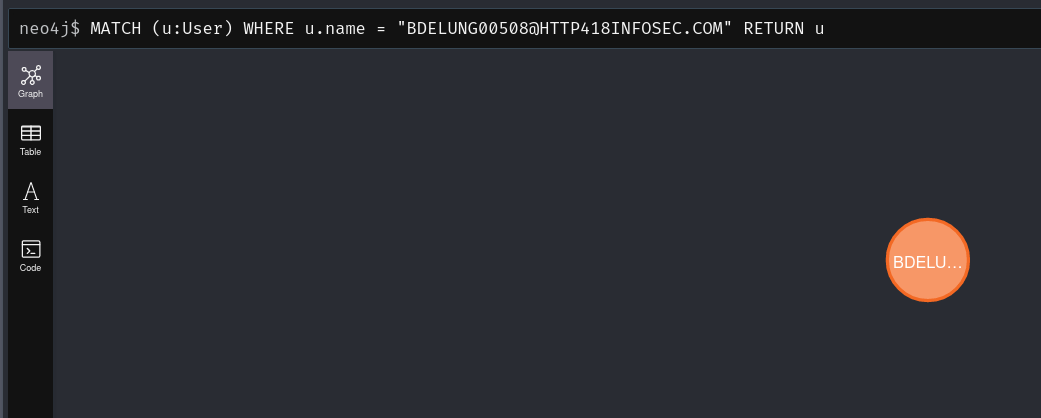
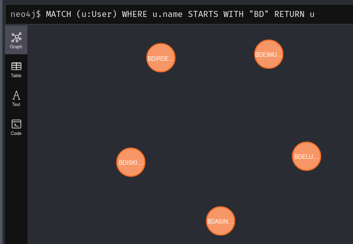
The u variable above will allow us to refer to all of the users impacted by the query above. For example, we can find all the users whose name begins with ‘BD’ using the query below. This will set u to represent all 5 users:

MATCH (u:User) WHERE u.name STARTS WITH "BD" RETURN u
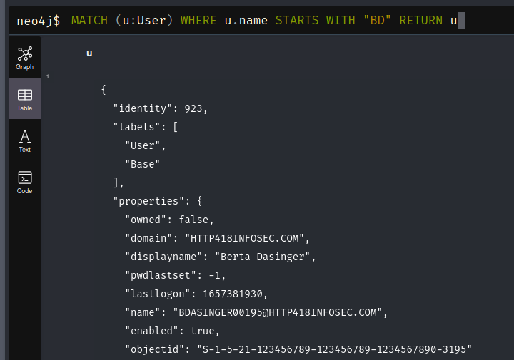
In order to return a single attribute from these users, we can change the value which we are returning. If we read the BloodHound documentation, there are a number of potential properties to return. We can also select the Table view to see all of the properties stored in the object:
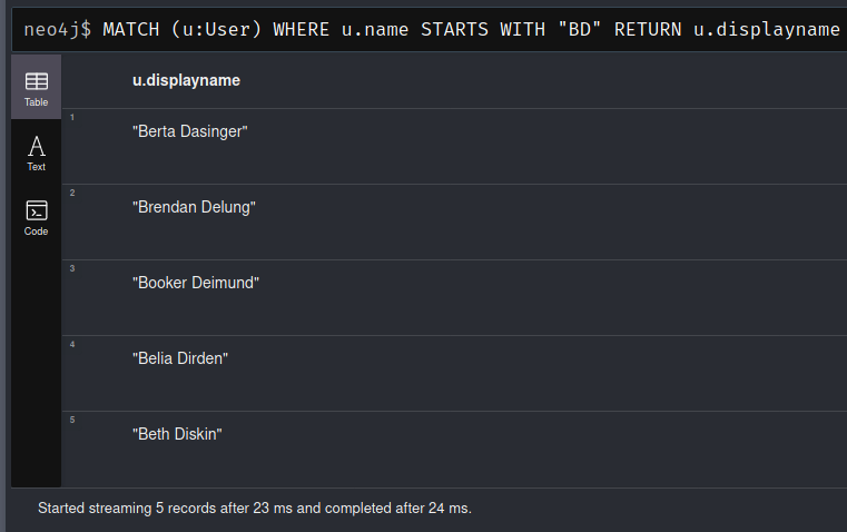
We could then alter our query to just return the displayname field with the following query:

MATCH (u:User) WHERE u.name STARTS WITH "BD" RETURN u.displayname
And we don’t have to just use Users, if we partially complete a query then Neo4j will suggest other types of we can use.
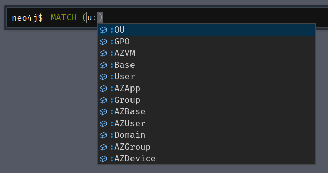
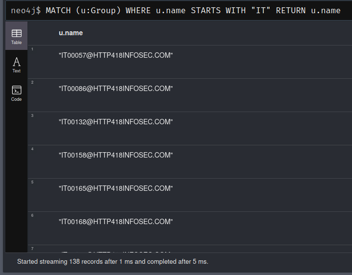
For example, we can return groups which begin with ‘IT’ by altering the query from MATCH (u:User) to MATCH (u:Group).

MATCH (u:Group) WHERE u.name STARTS WITH "IT" RETURN u.name
Analysing Relationships

This is all well and good, but the power of Neo4j comes from being able to identify relationships between nodes. To do this, lets find all the groups which BDELUNG00508 is within. To do this, we will need to search for Users which are a member of a group. This is done by using the following syntax:

MATCH (u:User)-[:MemberOf]->(g:Group)

This uses the ‘MemberOf’ edge in BloodHound to reveal users who are a member of a group. We will then need to filter this dataset down to only include the Brendan Delung user from our previous post, which we can do with the following command:

WHERE u.name = "BDELUNG00508@HTTP418INFOSEC.COM"

And finally, return the group names with

RETURN g.name.

Giving us a final command of:

MATCH (u:User)-[:MemberOf]->(g:Group)
WHERE u.name = "BDELUNG00508@HTTP418INFOSEC.COM"
RETURN g.name
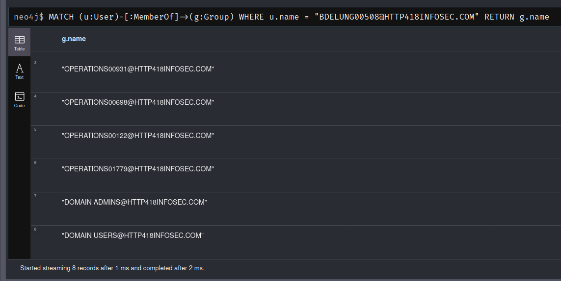
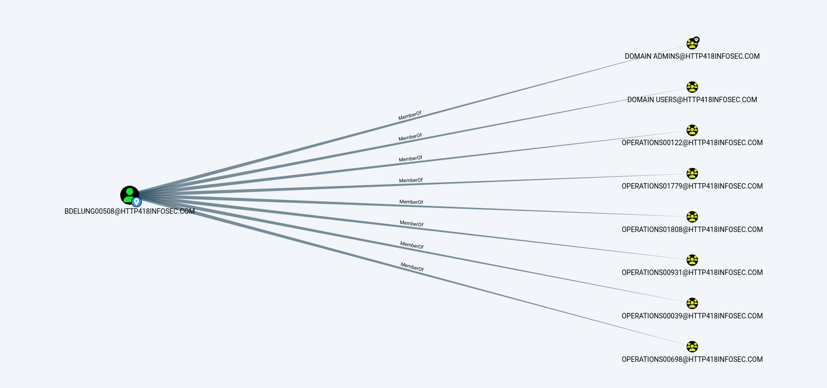
This is the equivalent command to the one we used in our original post, which can be represented by the following graph:
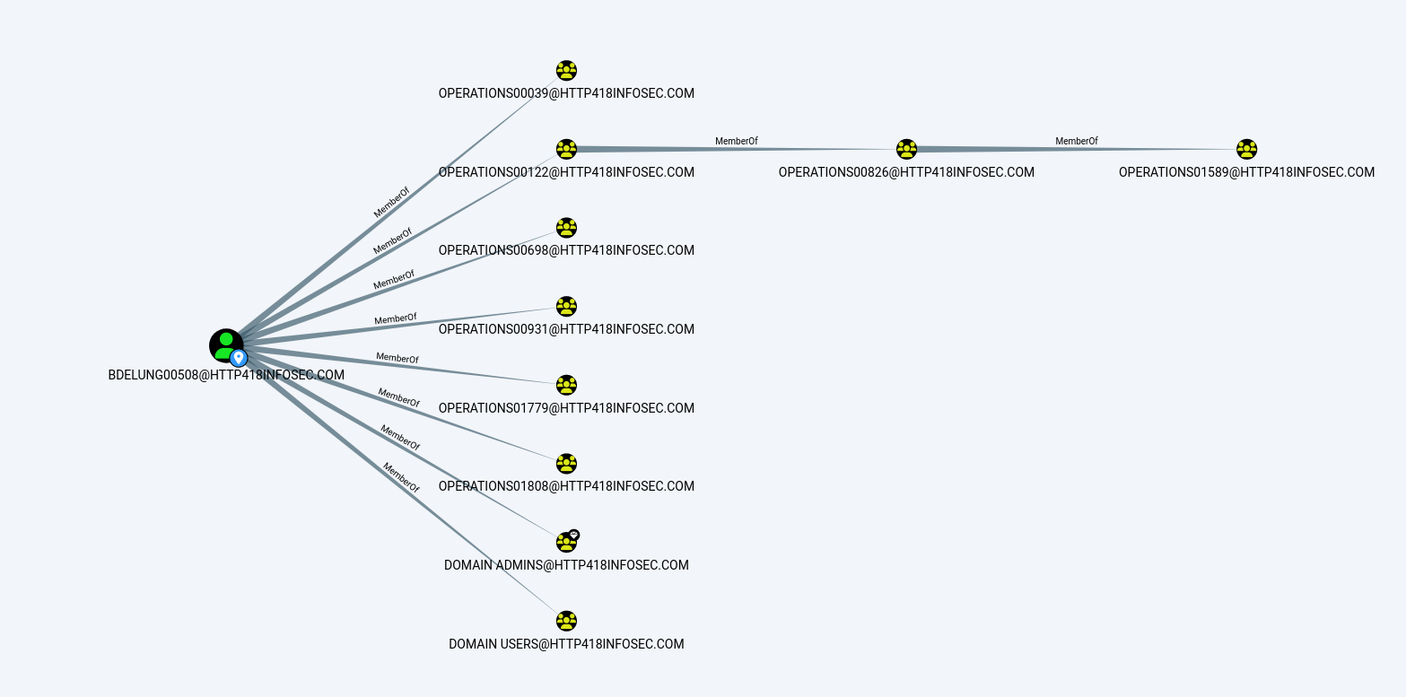
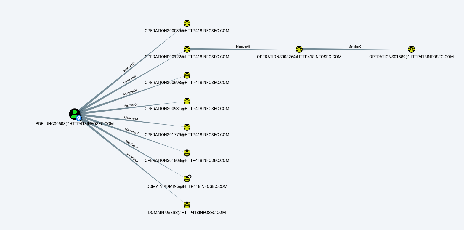
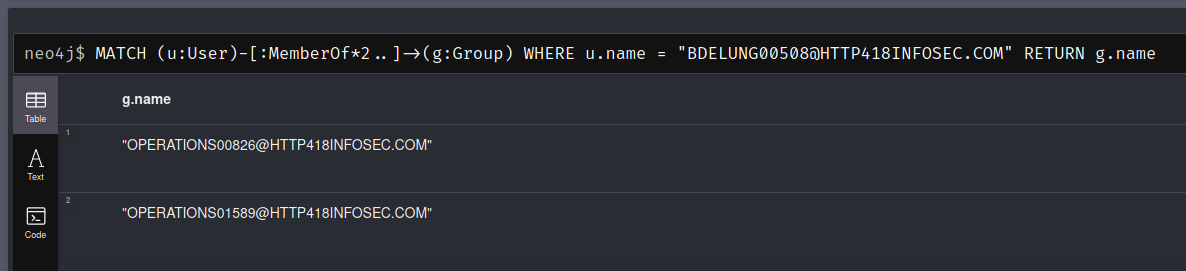
We can do some further queries to manipulate the data, for instance, what if we only want to return the nested groups?  To do this, we can use the *2.. Operator on the relationship section of the query to ensure that there are 2 consecutive MemberOf relationships. This will return the two groups on the right of the above image.

MATCH (u:User)-[:MemberOf*2..]->(g:Group)
WHERE u.name = "BDELUNG00508@HTTP418INFOSEC.COM"
RETURN g.name
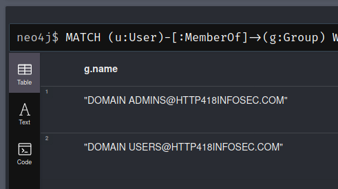
Or if we want to ignore any of the groups beginning with “Operations“, then we can use the NOT operator:

MATCH (u:User)-[:MemberOf]->(g:Group)
WHERE u.name = "BDELUNG00508@HTTP418INFOSEC.COM" AND NOT(g.name STARTS WITH "OPERATIONS")
RETURN g.name
Pathfinding

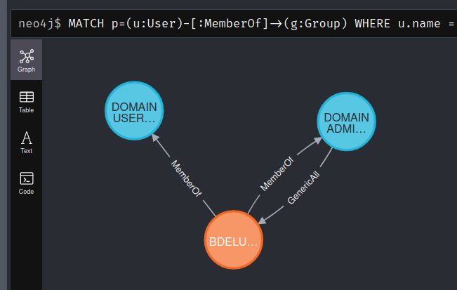
If we want to represent any of these as a ‘path’ rather than a table, we can use the p= operator. For example, if we want to view the previous query as a path we would add p= to the beginning of the query and return the p variable.

MATCH p=(u:User)-[:MemberOf]->(g:Group)
WHERE u.name = "BDELUNG00508@HTTP418INFOSEC.COM" AND NOT(g.name STARTS WITH "OPERATIONS")
RETURN p
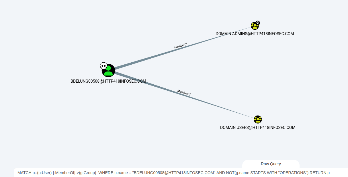
We can run this query in BloodHound using the ‘Raw Query‘ tab at the bottom of the screen. This allows us to interact with the results using the BloodHound GUI, rather than Neo4j. Below we can see the query above but within the GUI.
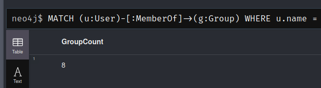
Finally, using one of the previous queries we can use the COUNT operator to count the amount of results returned. We will use this extensively later on. In this case, we will count the number of groups which BDELUNG00508 is explicitly added to, ignoring any nested groups.

MATCH (u:User)-[:MemberOf]->(g:Group)
WHERE u.name = "BDELUNG00508@HTTP418INFOSEC.COM"
RETURN COUNT(g) AS GroupCount
Assessing AD

Enough of the theory, lets start to combine some of these features together! In this section I will cover a range of queries which I have had success with previously. Most of these queries can be repurposed to cover whatever group of assets you are interested in. Common examples of groups might be:

  • AD Administrators/privileged accounts
  • Tier 0 or Tier 1 assets
  • Privileged Software users
    • ADCS
    • ADFS
    • SCCM
    • AV/EDR
    • Backup systems
    • Exchange Admins
  • Interesting user groups
    • Developers
    • SOC
    • Cloud Admins

Find All Nested Users For A Specific Group

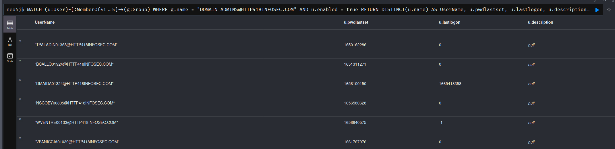
This is handy to find all of the users for a specific AD group. By analysing multiple nested groups, we can find users who have access to our chosen group, but we might not have been aware of. This is very similar to the query used above, except we are finding the users in a group, instead of the groups a user is in. Also we are using the DISTINCT function for the output, to prevent duplicate results.

In this query, several other parameters are also returned which can be handy for further analysis. For example pwdlastset can help us find accounts which have old passwords, or the description field can shed light as to why this user has access to this group. In this example I am using the Domain Admins group, but it works well against systems such as Exchange with groups such as Exchange Recipient Administrators.

The 1..5 operator should be modified depending on the complexity of the environment. I would recommending starting at 1..2 or 1..3 (i.e. A maximum of 2 or 3 nested groups), as this will get exponentially more complex, and can cause BloodHound to crash if you arent careful!

MATCH (u:User)-[:MemberOf*1..5]->(g:Group)
WHERE g.name = "DOMAIN ADMINS@HTTP418INFOSEC.COM" AND u.enabled = true
RETURN DISTINCT(u.name) AS UserName, u.pwdlastset, u.lastlogon, u.description
ORDER BY u.pwdlastset ASC
Find Exploitable Edges To A Wildcard Group Name

This allows us to find users who have an exploitable relationship with an object which is then a member of a group of interest. An exploitable relationship in this case would mean that further actions need to be taken before the user actually has access to the group. For example, it might have an AddMember permission over a group – so whilst they dont currently have access to the group, they could add themselves into it.

In the example below, we are looking for users who could grant themselves access to an AD object, which is then in turn a member of a group with ‘Exchange’ in its name (WHERE g.name =~ "(?i).*exchange.*").

This is handy to find users with dangerous misconfigurations which could lead to sensitive applications becoming compromised. This deliberately doesn’t include the MemberOf edge in the first section of the MATCH statement – as we are specifically looking for the more hidden misconfigurations.

MATCH (u:User)-[:AddMember|AddSelf|WriteSPN|AddKeyCredentialLink|AllExtendedRights|GenericAll|GenericWrite|WriteDacl|WriteOwner|Owns*1..4]->(o)-[:MemberOf]->(g:Group)
WHERE g.name =~ "(?i).*exchange.*"
RETURN DISTINCT(u.name), g.name

Find Users With Admin Access To Domain Controllers

For this query we specifically look for users with nested access to an object, which then has admin access onto computers within a group. This could be altered so that the group name is an Exchange Servers group, or DB servers etc.

MATCH (u:User)-[:AddMember|AddSelf|WriteSPN|AddKeyCredentialLink|AllExtendedRights|GenericAll|GenericWrite|WriteDacl|WriteOwner|Owns|MemberOf*1..4]->(o)-[:AdminTo]->(c:Computer)-[:MemberOf]->(g:Group)
WHERE g.name STARTS WITH "DOMAIN CONTROLLERS"
RETURN DISTINCT(u.name) AS UserName, o.name AS GrantingObjectName, c.name AS DCName
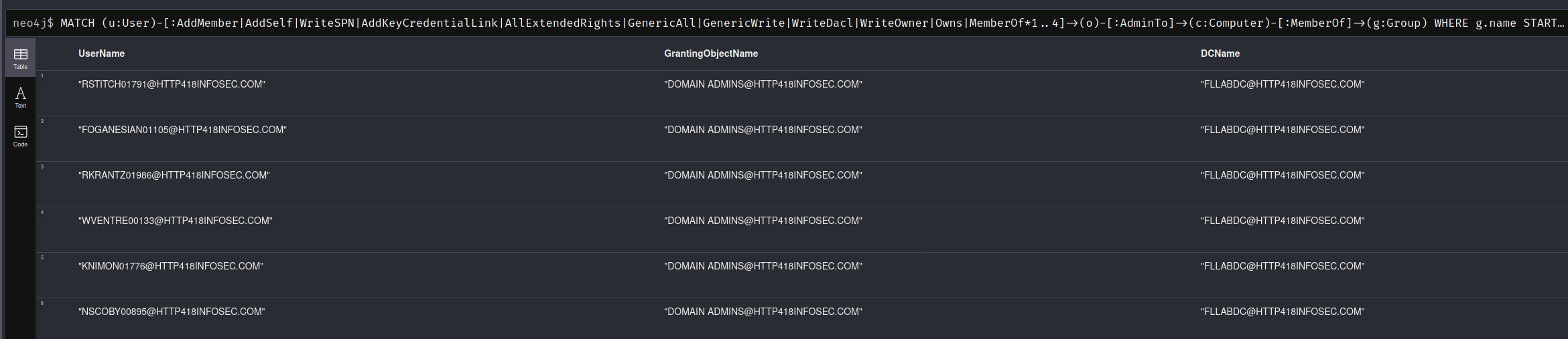
With this query, we can see a number of users go via the Domain Admins group to get access to the FLLABDC Domain Controller. All of the users in this query are actually legitimate domain admin users, so we could extend the query to ignore any users who go via the Domain Admins group (As Domain Admin users will have admin access to Domain Controllers)

MATCH (u:User)-[:AddMember|AddSelf|WriteSPN|AddKeyCredentialLink|AllExtendedRights|GenericAll|GenericWrite|WriteDacl|WriteOwner|Owns|MemberOf*1..4]->(o)-[:AdminTo]->(c:Computer)-[:MemberOf]->(g:Group)
WHERE g.name STARTS WITH "DOMAIN CONTROLLERS" AND NOT(o.name STARTS WITH "DOMAIN ADMIN")
RETURN DISTINCT(u.name) AS UserName, o.name AS GrantingObjectName, c.name AS DCName

Find All Active ‘Decommissioned’ Objects

Focusing on the auditing side of BloodHound, we can search for all objects which mention they are disabled or decommissioned, but are in fact still active. This is very much matter of Active Directory hygiene, and is less about finding a 1337 way of compromising a domain – but you never know!

MATCH (o)
WHERE o.enabled = true AND (o.description =~ "(?i).*disabled.*" OR o.description =~ "(?i).*decom.*")
RETURN o.name AS Name, o.description AS Description

This does rely on the description field containing either ‘disabled’ or ‘decom’, so it isn’t 100% accurate. You could also do a query to look at last login times and perform some sort of logic based on that.

Find The Most Dangerous ‘Decommissioned’ Objects

As a rough way of quantifying the most ‘dangerous’ decommissioned objects, we can perform a basic way of finding outbound access from any users we identified in the query above.

MATCH (o)-[:MemberOf*1..3]->(g:Group)-[r]->(n)
WHERE o.enabled = true AND (o.description =~ "(?i).*disabled.*" OR o.description =~ "(?i).*decom.*") AND r.isacl = true
RETURN o.name AS Name, o.description AS Description, COUNT(DISTINCT(n)) AS OutboundAccess
ORDER BY OutboundAccess DESC

This will look for any groups which our ‘decommissioned’ objects are within, then find the number of objects which those groups can access. We could alter this to look for groups which grant local admin rights, or look for exploitable AD permissions (i.e. GenericAll, WriteDacl etc) rather than nested group membership (i.e. -[:MemberOf*1..3]-> )

Finding Legacy Privileged Accounts

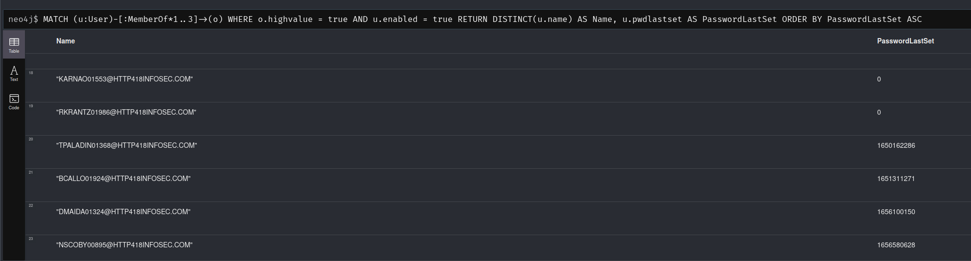
We can leverage the highvalue attribute within BloodHound to find users of interest, and then use the pwdlastset attribute to find accounts with older passwords, which might not be subject to more modern password requirements and could well be very weak.

MATCH (u:User)-[:MemberOf*1..3]->(o)
WHERE o.highvalue = true AND u.enabled = true
RETURN DISTINCT(u.name) AS Name, u.pwdlastset AS PasswordLastSet
ORDER BY PasswordLastSet ASC
We could also modify this to find users who mistakenly have access to high value targets. If we assume that an internal naming scheme of T0_ is used for all Tier 0 accounts, we could ignore them in our query to find all users who arent Tier 0. For example:

MATCH (u:User)-[:MemberOf*1..3]->(o)
WHERE o.highvalue = true AND u.enabled = true AND NOT(u.name STARTS WITH "T0_")
RETURN DISTINCT(u.name) AS Name

Evaluate Local Admin For A List Of Users

If you have a list of users of interest, you might want to evaluate how much onward administrative access they have. For example, users with weak passwords or legacy accounts which are due to be decommissioned. The query below is a basic way of performing this query.

MATCH (u:User)-[:MemberOf*1..3]->(g:Group)-[:AdminTo]->(c:Computer)
WHERE u.name IN ["RSTITCH01791@HTTP418INFOSEC.COM", "CSTURKEY00066@HTTP418INFOSEC.COM", "RFLITCROFT00516@HTTP418INFOSEC.COM"]
RETURN u.name AS Username, COUNT(DISTINCT(c)) AS AdminCount
ORDER BY AdminCount DESC

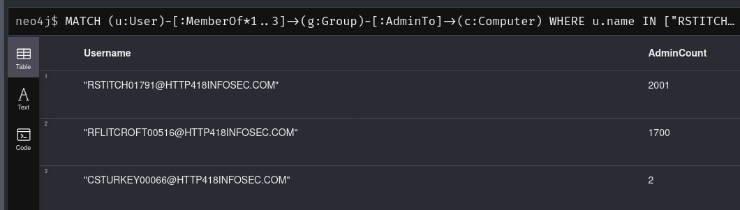
Which returns the number of systems which each user has local admin access to, showing that RSTITCH01791 is extremely powerful.
Evaluate Devices Which Allow Unconstrained Delegation

Unconstrained Delegation is a very dangerous attack primitive which can allow for a range of attacks. Therefore, it is essential that any devices which allow this attack are known about (and ideally removed!)

We can find devices which support it via the unconstraineddelegation attribute. For example, the query below will find users who are in nested groups, which have local admin access to a device which supports unconstrained delegation.

MATCH (u:User)-[:MemberOf*1..3]->(g:Group)-[:AdminTo]->(c:Computer)
WHERE c.unconstraineddelegation = true AND c.enabled = true AND u.enabled = true
RETURN c.name AS ComputerName, COUNT(DISTINCT(u)) AS AdminCount
ORDER BY AdminCount DESC

This could be extended to include any exploitable AD permissions (i.e. GenericAll, WriteDacl etc) rather than just group membership, but for now we can get a sense of how many users in our organisation have access:
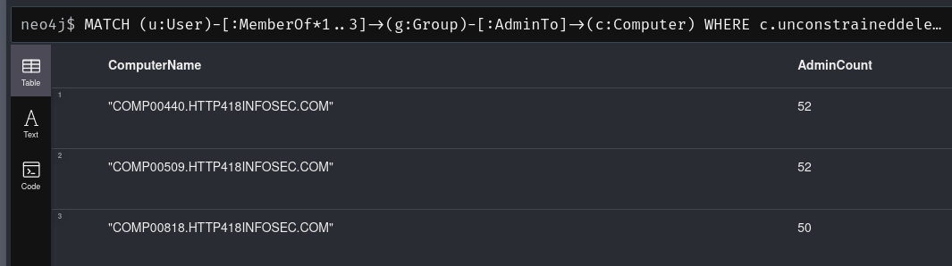
This is the same data as from the Unrolled Admins view on an individual asset – except we can now find this value for every vulnerable device in the BloodHound dataset!

Finding Shortest Path To Unconstrained Delegation

Given our data above, we could simply begin remediation from the devices with the most admins to the least. Whilst this would be a valid way of evaluating the data, we should also consider other factors – such as how easy is it to gain admin access? For example, if one of the admins is kerberoastable then we are in big trouble!

We can check this with the following query:

MATCH p=shortestpath((u:User)-[*1..]->(c:Computer))
WHERE c.unconstraineddelegation = true AND c.enabled = true AND u.enabled = true AND u.hasspn = true
RETURN p

Which we will run in BloodHound’s GUI:
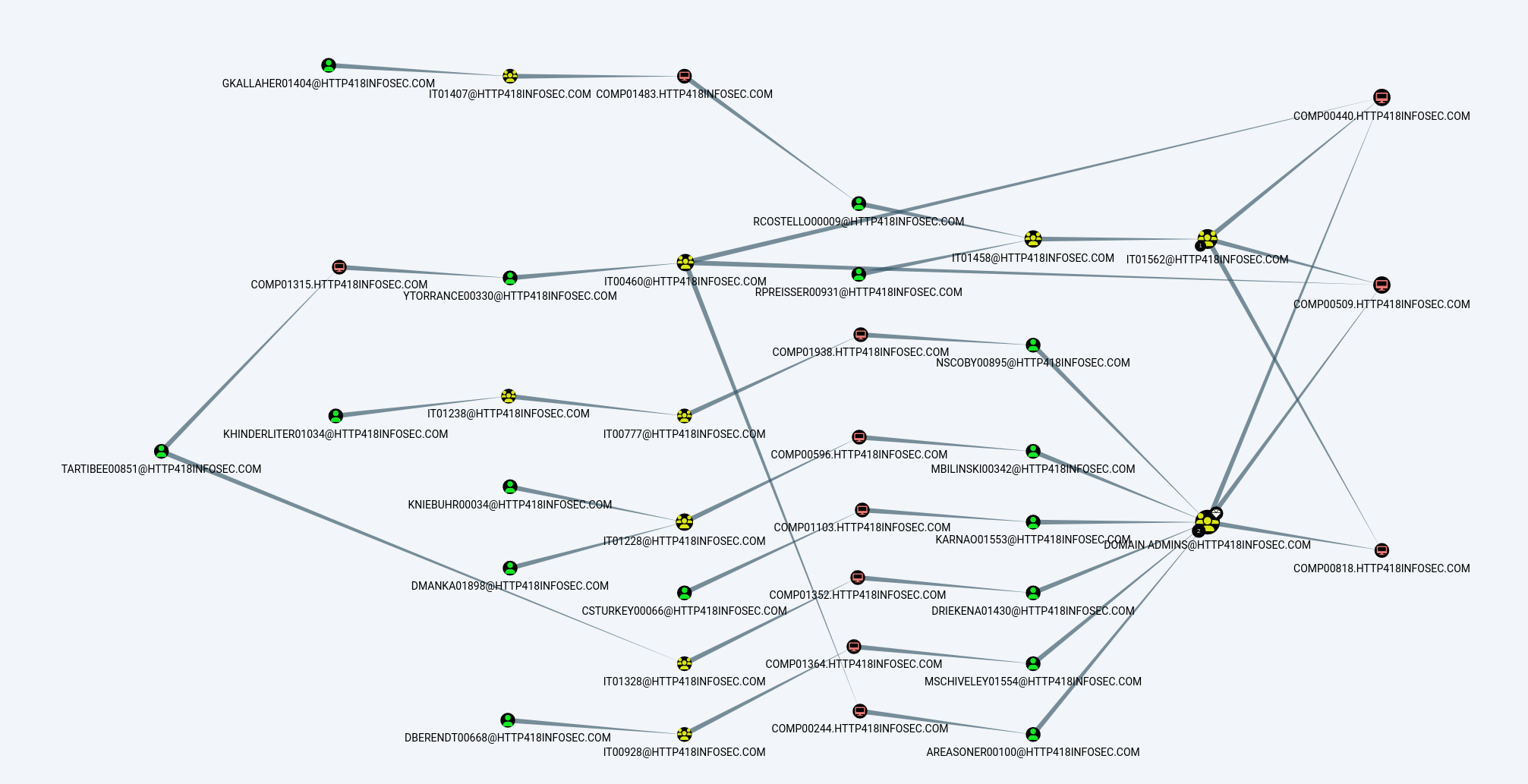
Now we can see that there are a range of kerberoastable users who eventually have access to systems which support unconstrained delegation – including routes via the Domain Admins group!

Summary

In summary, BloodHound is an extremely flexible way of evaluating an AD environment. The ‘standard’ version is excellent at allowing this point-in-time evaluation, with BloodHound Enterprise being far better suited to continuous evaluation.

There are an enormous amount of BloodHound queries both within the tool, and on GitHub which will show even more ways in which Cypher can be used and are a great way of understanding the Cypher language!
Further Reading

BloodHound Basics

Over the past months and years at $dayjob, I have done a lot of work with BloodHound to remove attack paths and improve the attack surface of our Active Directory environment. During this time I have found a number of ways to leverage BloodHound to perform what is effectively an audit of Active Directory, by identifying key attack paths and quantifying issues within large enterprise environments.

Initially, I found the more advanced query language (Cypher) to be quite complex, but it is very powerful and just happens to use a slightly different structure to other languages such as SQL.

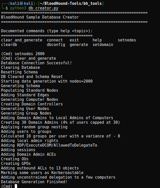
To start, Ill generate a BloodHound dataset using the DBCreator script provided by SpecterOps. Following that, I will cover what Cypher is and explain some of its features in a later post. Finally, I will share some queries which can help to audit your environment.

For this guide, I wont cover what BloodHound is or the very basics of the program. There are other guides which already exist which do a great job of this, and the documentation is very thorough.

Environment Prep

Lets use the DBCreator script, but we will use byt3bl33d3r’s PR to fix some of the issues in the original version. This section does get a bit techy, so skip over the install section if you just want to learn about BloodHound!

I had a lot of issues getting this to work, so I simplified the usage of pickle in the MainMenu class. By changing the assignment to first_names and last_names to something simpler:

first_pickle = open("data/first.pkl",'rb')
last_pickle = open("data/last.pkl",'rb')

self.first_names = pickle.load(first_pickle)
self.last_names = pickle.load(last_pickle)

cmd.Cmd.__init__(self)

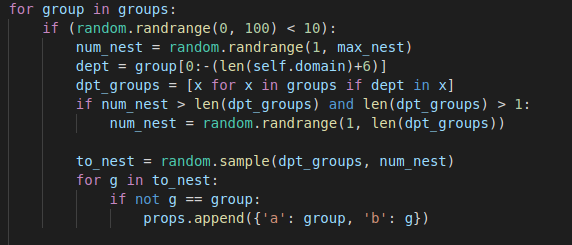
I also found the environment variables didn’t work, so I opted to clear them, and finally the group nesting function uses a hardcoded value (dept = group[0:-19]) for the length of the default ‘TESTLAB.LOCAL‘ domain name. I changed this to the value of self.domain + 6 to return the correct value & work as expected.

dept = group[0:-(len(self.domain)+6)]

The final group nesting logic is:

I will make a PR for this if I get around to it one day!

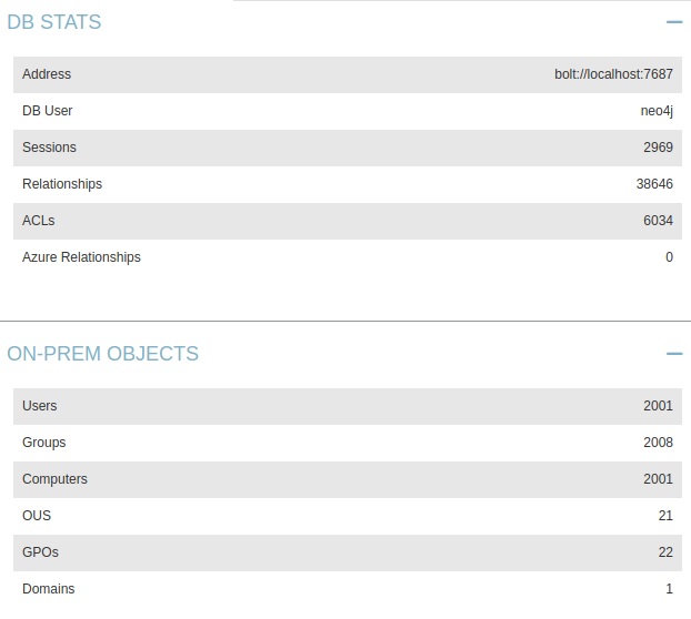
And lets load up BloodHound to verify it worked correctly:

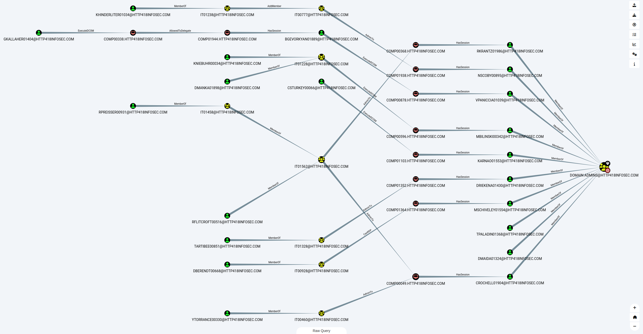
And we get a pretty neat graph out of it when we run one of the pre-built queries – but more on this later on!

Basic Analysis

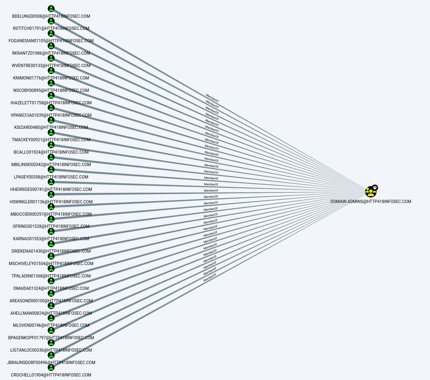
When we have our data loaded into BloodHound, we are presented with a view which shows all of the Domain Admins in the data we gathered. In my example, there are a lot of Domain Admins, so the graph is quite large!

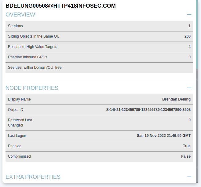
We can click on any of these users to load details on that specific user. For example we can see that BDELUNG00508@HTTP418INFOSEC.COM is the account for Mr Brendan Delung.

We can use this to show some basic information on the user, such as their name (Brendan Delung), when they last logged in (Sat 19th November 2022)

If we scroll down a bit to the Group Membership section, we can see the First Degree Group Membership entry. This complex name is another way of saying the groups which this user is a member of. From when we first loaded up BloodHound, we know that Brendan is a member of the Domain Admins group (i.e. DOMAIN ADMINS@HTTP418INFOSEC.COM). From the screenshot below, we can see that Brendan is a member of 8 groups (including the Domain Admins).

If we click on this row, BloodHound will run a query in the background to show the groups which Brendan is a member of in the graph view. The view now shows us the groups:

Another option to represent the groups which a user is a member of is the Unrolled Group Membership, which is below the First Degree Group Membership feature we just used.

This takes the output from above, and then checks if any of these groups are within other groups and so on. Again, by clicking on the row we can see the graph which it creates, showing a further 2 groups which BDELUNG00508 is part of:

As we can see, the first ‘column’ of yellow nodes show the groups we could see before (Starting with OPERATIONS00039), but now we can see that the OPERATIONS0122 group is a member of another group (OPERATIONS00826), which itself is within another group (OPERATIONS01589)!

This shows the power of BloodHound, as running queries like this gets very complex with large environments. Whilst the output here is a little boring to us as an attacker, it becomes far more interesting if one of these unrolled groups has access which was not expected, such as local admin to a server.

Pathfinding

BloodHound allows us to find paths between AD objects easily, using the ‘Pathfinding’ option in the UI.

If we click on this icon, we can now enter a ‘Start Node’ and ‘Target Node’ – in other words, where are we and where do we want to get to.

In the context of a red team, the Start Node could be a user who has been phished, and the End Node could be the Domain Admins group (Or whatever we want to ultimately compromise), which would show attack paths to obtain domain admin rights.

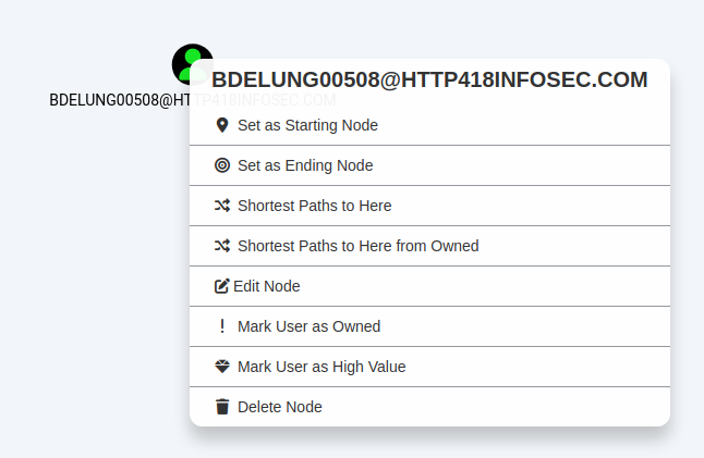
We can also fill this detail in by right clicking on a node and then selecting either ‘Set as Starting Node’ or ‘Set as Ending Node’.

To show this, we will use DBERENDT00668 as our starting point.

As we type in a group, BloodHound will autofill suggestions:

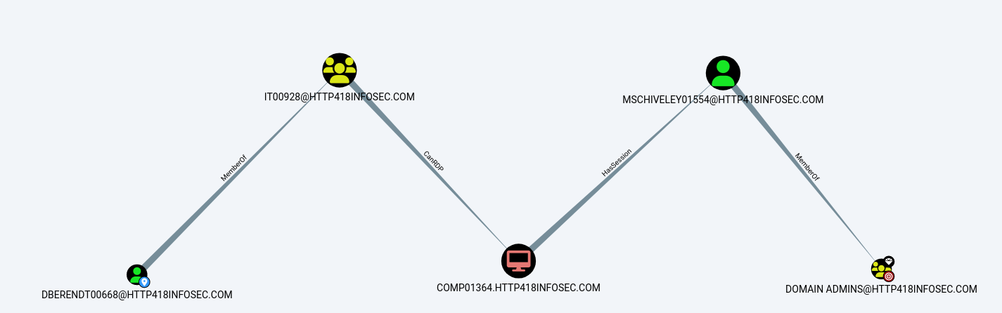
After some thinking, BloodHound will show us an ‘attack path’ – the steps we would need to take as an attacker to become a Domain Admin user.

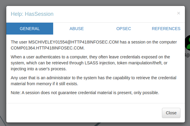
To explain the above attack path, DBERENDT00668 user is a member of the IT00928 group. Members of this group can then RDP onto the COMP01364 server. This server then has a session for MSCHIVELY01554, who is a Domain Admin user.

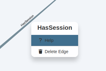
If we wanted to learn more about any of these permissions, we can right click on the ‘edge’ (The line between the coloured nodes) and then click on ‘Help’.

This will then give a short overview on how it could be exploited:

High Value Groups

BloodHound has the concept of ‘High Value Groups’, which represent the traditionally highly powerful groups within Active Directory such as Domain Admins, Enterprise Admins and so on. In short, if any of these AD objects are compromised by an attacker, it is very bad news! In the graph view, these objects have a small diamond on the top right of their icon.

Owned Users

Another core concept is marking users as ‘owned’, which can be done by right clicking on a user and clicking on ‘Mark User as Owned’. This does two things:

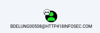
  1. Marks the user object with a little skull symbol to show they are owned
  2. Allows us to filter on ‘owned’ users in our queries

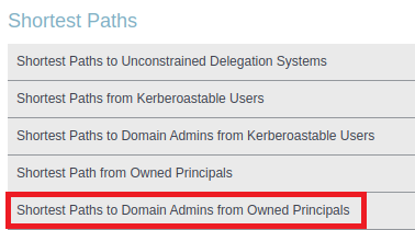
BloodHound has a number of queries to search from users who are owned – for example the Shortest Paths to Domain Admins from Owned Principals query, which will search from every owned user to find the shortest route to becoming Domain Admin.

I have found this feature to be very useful when combined with other datasets. For example, if a password spraying or cracking exercise is performed, then any weak accounts could be marked as ‘owned’. We can then use Bloodhound to highlight the issues posed by these accounts in a really visual way – showing just how ‘close’ a weak account might be to becoming a domain admin!

Moving Laterally

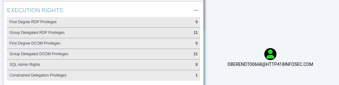
Another key use case for BloodHound is for attackers, when they have first landed in an environment and are looking to move laterally. If we assume that we have infected the DBERENDT00668@HTTP418INFOSEC.COM user, it would be time consuming to establish our access purely through LDAP or PowerShell queries.

If we load up the user, we can see that they have a lot of interesting outbound access. In the screenshot below we will focus on the Execution Rights section of BloodHound. This shows the permissions that our user has. For example First Degree RDP Privileges will show the servers where our user has been explicitly granted access via RDP.

The Group Delegated RDP Privileges will show servers where our user is in a group (or nested groups) which has been granted access to a resource via RDP. More information on how this could be abused can be found on the BloodHound wiki.

If we click on the Group Delegated RDP Privileges entry above, BloodHound will again render this into a graph for us – showing that 6 different groups are granting access to servers via RDP for this user.

Custom Queries

Finally, at the bottom of the graph view is the ‘Raw Query’ tab, which allows us to run our own custom queries in the ‘Neo4j’ language – which we will cover in my post on the more advanced usage of BloodHound. This allows us to run far more complex queries and quantify a lot of the data in AD rapidly.

Diagrams: Timelines

Aren’t timelines great?!

Anyone who has spoken with me will know that I am a huge fan of diagrams as a way of breaking down complex topics into easier to understand concepts. Over the past few months and years at $dayjob, I have produced a number of diagrams during the reporting phase of our internal testing. Over this post, Im going to focus on one particular type of diagram – the mighty timeline. Bear in mind that these timelines work well from both an offensive and defensive standpoint!

There are several key benefits to producing these timelines, in no particular order:

  1. It ensures that you fully understand the order in which activity occurred. For example:
    • Do we know exactly where we obtained credentials X?
    • Where did they attempt to use them?
    • Do we know all of the hosts which a threat actor moved laterally onto?
  2. If you make this timeline during the live testing window, it serves as an excellent tool for deconfliction between red team activity and the blue team.
  3. These timelines can be given as part of an executive overview without having to dig into vast levels of detail and can help to visualise the stages of an attack

For context, my role at $dayjob is more of a white-team role, where I organise and co-ordinate red team testing – so I often have to do debriefs on the output of red team testing!

More Timelines!

For this post, I will be using the GDPR report into the British Airways hack. As a public document, we can use this to produce a potential timeline of the incident by reading between the lines of the content included in the report. I will emphasise that I have no idea on the detail behind the BA hack, all the detail in this post is from the ICO ruling. Any detail which is actually true is purely by coincidence (a.k.a. Please don’t sue me).

Throughout this, I will be using Draw.io which is a free alternative to Visio. If you have the option, I would recommend Visio as it does have some nice extra features.

Typically, I produce 4 diagrams for any complex red team engagement:

  • Low-Level Diagram
  • Medium-Level Diagram
  • High-Level Diagram
  • Defensive Improvement Opportunities

Low-Level Diagrams are typically shared with our trusted agents, or the defensive teams following any testing. High-level diagrams & ‘Defensive Improvement Opportunities’ diagrams are used extensively for stakeholder debriefs or in PowerPoint presentations. Medium-level diagrams tend not to be used all that much in my experience, but still have their place!

Low Level Diagrams

For these low level diagrams, I feel that there is basically no limit to how detailed they can be. From my experience, these are what I use on a day to day basis through the live testing period. These are eventually shared with the blue teams in order for them to learn from and to correlate any alerts and detections – so the more detail the better!

They also serve as an excellent tool for deconfliction, so I would recommend producing them as you go if at all possible. The process of making these diagrams often reveals any areas which you don’t fully understand, so you can clarify your knowledge with the red team lead before the reporting stage begins in anger.

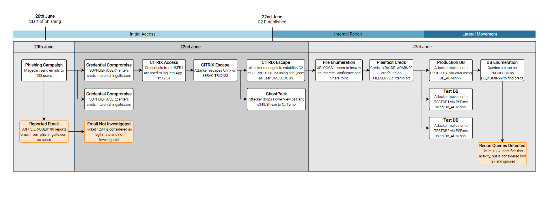
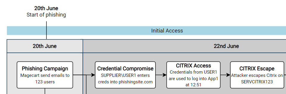
An example could be the following, focusing on the initial days of the attack on BA:

There are a few features of this diagram which I find have been useful, going from top to bottom in the diagram:

  • Adding a few brief summaries of key points can help to draw attention to key events. I tend to keep these key milestones the same across all of the diagrams I produce, from the low-level to the high-level diagrams. This helps to highlight the key moments in what can sometimes be quite complex diagrams!
  • A rough summary of the kill-chain steps can help to indicate what was happening at the given time.
  • Again, splitting the background colours up into individual days will help to distinguish each days activities. I find this also helps to indicate how much activity occurred. For example, the 22nd was clearly a very busy day for Magecart in the diagram above.
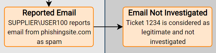
  • Highlighting SOC tickets or other defensive actions can help to tell the story of any near misses, and show potential areas for improvement. Again, these are totally fictitious SOC tickets (Please don’t sue me)

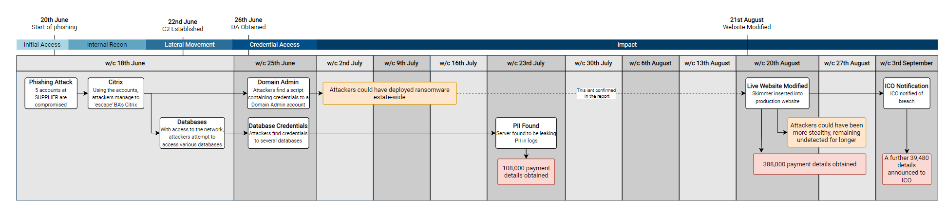
High Level Diagrams

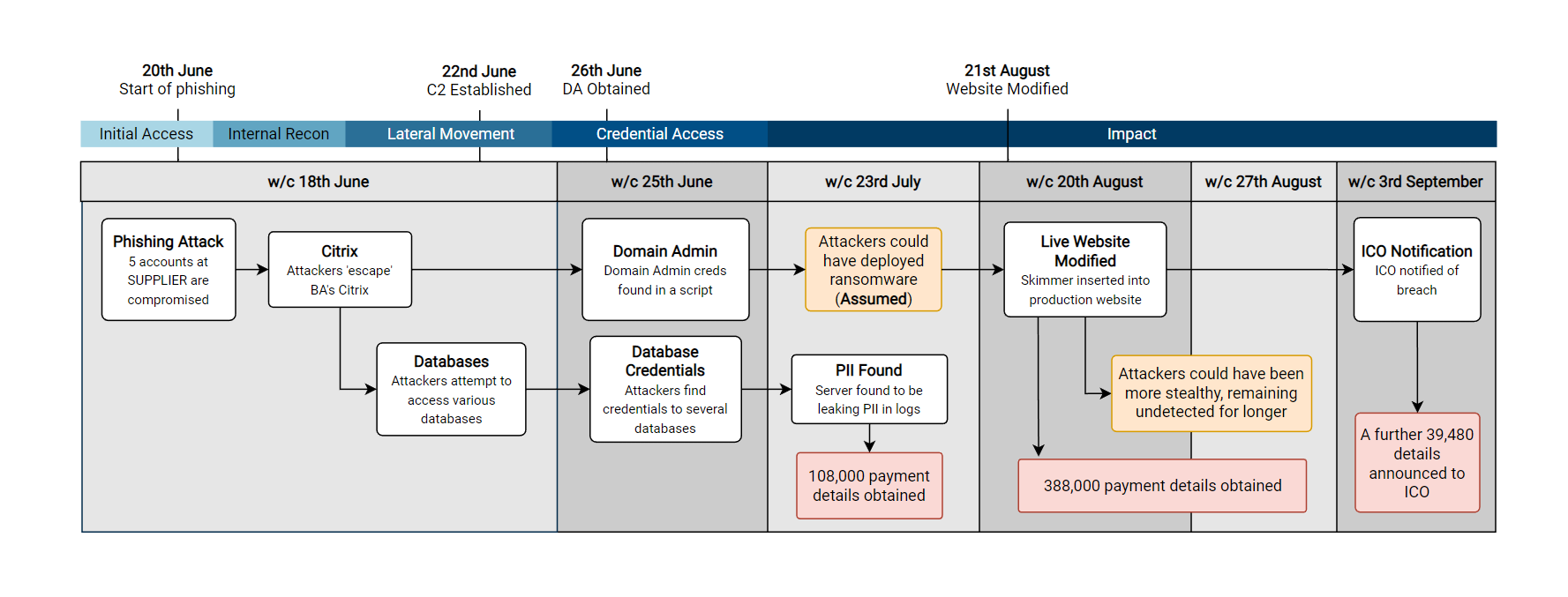
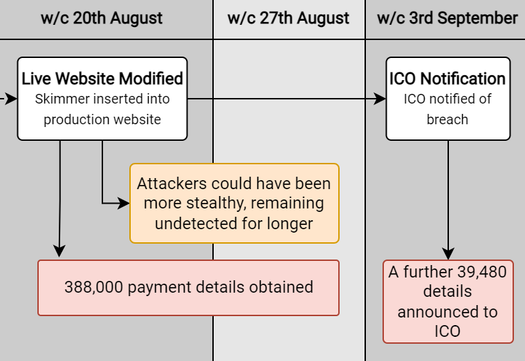
For these diagrams, I normally try to be quite succinct in the comments made on the diagram. As you’ll see below, there are far less boxes, and they contain less technical information. This is intentional, as this sort of high-level diagram is more likely going to be viewed by less technical stakeholders, who (unfortunately) wont care about the leet techniques used to gain initial access. This also has the added advantage that these diagrams will then tend to fit into a PowerPoint slide without having to be split up.

In order to maintain consistency, I have again included the key milestones and kill chain elements, and am instead using a scale of weeks instead of days.

Another option which can be handy, is to create a diagram which includes every day (or week) for the time period which you are covering. For example, in the diagram above I deliberately didn’t include the 2nd, 9th or 16th July as there was no activity. In the diagram below I have included it, which can put highlight the length of dwell time between periods of activity.

From the below diagram, we can clearly see that there were two significant periods with no major activity – which highlights the length of time from initial access to detection.

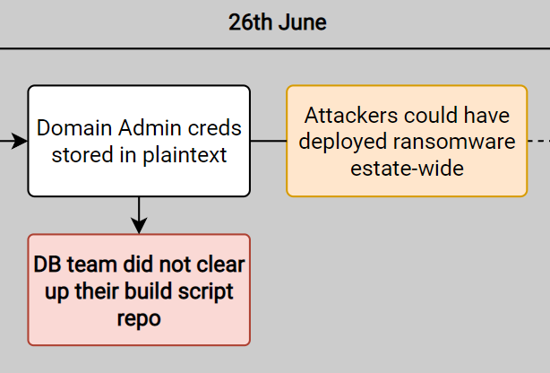
In prior tests, I have also taken this time to point out what could have happened during the red team exercise. For example, above I point out that ransomware could have been deployed – an action which would have likely been very damaging for BA’s estate (And arguably financially crippling compared to the GDPR fine they ended up with).

Whilst this is more relevant for tests where I operate as a white team lead, it can be useful to apply some business context to the findings. For example, adding a box to clarify potential business impacts which could have occurred:

  • “With access as user X, testers could have compromised system ABC but decided on other targets”
  • System ABC was compromised, but testers used an alternate route to achieve Objective X”

Defensive Improvement Opportunities

The final ‘style’ of timeline diagram which I will cover is the ‘improvement opportunities‘ diagram. This has been a secret weapon of complex internal debriefs, where suggestions from a red team report can be mapped onto a timeline, showing the potential solutions to the key findings of a red team exercise.

Following the debrief of a test, the next logical question on most people’s mind is “How do we fix this?”. Therefore having a diagram which contains recommendations mapped to the testing timeline is a good starter for this conversation. If a particular event from testing draws a lot of attention, then it can help to direct the discussion. For example below, if the initial access was especially concerning to the audience, then there are 4 potential options which could be discussed to aid remediation (REC01, REC02, REC03, REC04).

Below is a snippet of what could have been produced for the initial stages of the BA report (With several fictitious additions from myself to make it a little more interesting)

The naming of this diagram is admittedly very woolly, but it is very much deliberate (And not me running out of ideas for new timelines). This slide typically will lead to a lot of ‘discussion’, and so it is best to ensure the language used remains neutral and simply presents the facts without any opinion. For example, instead of including a statement of ‘The entire Citrix team effectively have Domain Admin permissions’, I would instead simply suggest an AD permissions review to ensure I don’t see my P45 any sooner than I need to.

As you can see, splitting the findings into procedural and technical ‘improvement opportunities’ can help to distinguish between two common groups for these opportunities. Depending on the test, these groups might change – or you might find that splitting them into groups isn’t that much use!

I would also advise giving a unique reference to each suggestion (e.g. REC01, REC02…) , as it makes it far easier to discuss the suggestions and ensure that everyone is referring to the same item on the diagram! Additionally, it means that any actions or notes can be accurately taken – there’s nothing worse than having to second guess your notes after a debrief!

Timeline Guidelines

As you may have noticed from the diagrams above, I try to be quite consistent with how I lay them out and design them. I find that this consistency makes them easier to read, and means the audience can focus on the content rather than unusual layout or styling choices!

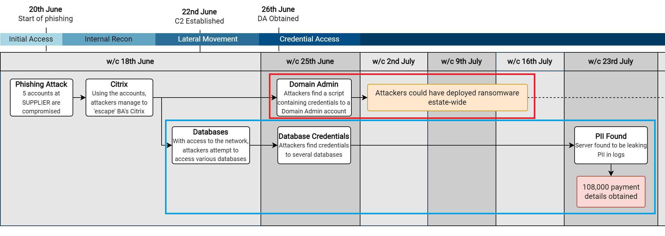
One of the most important things I find is to ensure the direction of the arrows makes logical sense when laying out a timeline. For example, in the high-level view below, I have highlighted the two ‘rows’ of events I created to show the two separate strands of activity:

  1. Red – The potential ransomware angle
  2. Blue – The eventual PII theft angle

This also makes it clear that both of these chains of events stem from the same initial point (Citrix compromise & break-out).

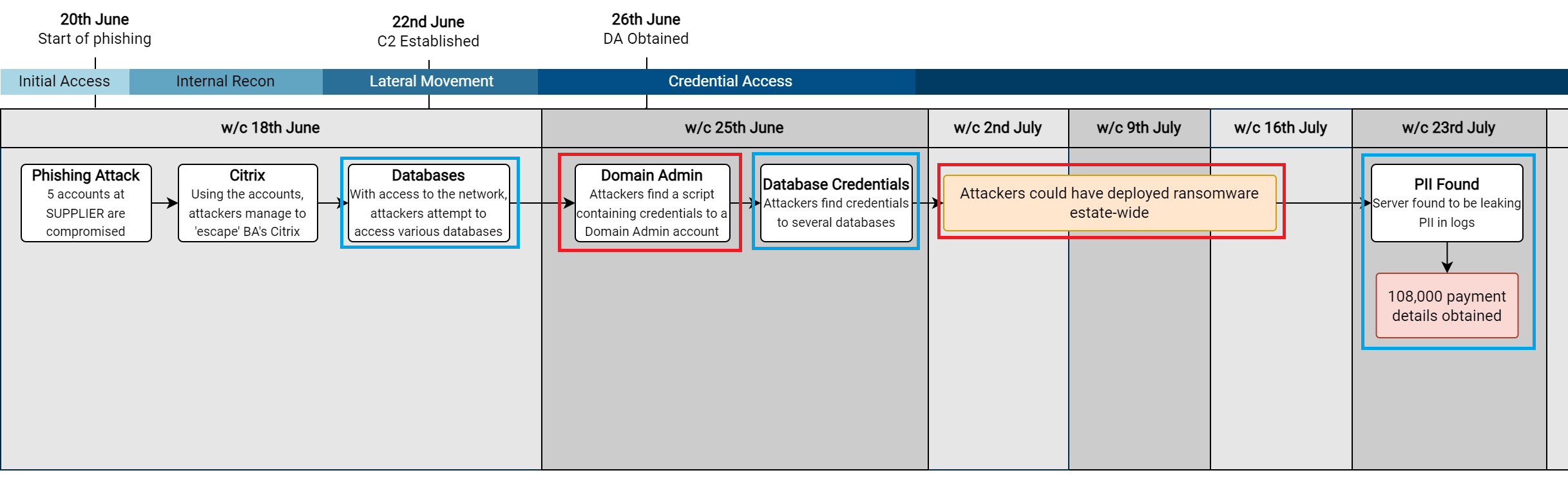
To show why I use these distinct ‘rows’, I have made another diagram below which only uses a single ‘row’ for the events.

This shows how the narrative behind a red team exercise (or incident) can quickly become confusing if we decide to do this, as it is hard to distinguish how each action was achieved. For example:

  • Did we get Domain Admin privileges from a database server?
  • Could ransomware have been deployed estate-wide from a database?

I try to use the same font across the entire diagram. In areas where I want to draw attention, I typically make the font bold and increase it by a font size or two. If you need to add more even more detail to an event, I typically just add it into a comment on the shape when I am using Visio – so that I can refer back to it later on. For example, below I make the title of the boxes bold, but keep the text the same size.

In terms of the colours to choose, I would be careful when using shades of red and green, as they have connotations of red being bad and green being good – which you might not want! I have found the following colours to work well for specific events:

ColourUsage
Dark Pink (Totally not red 😉 )Key attacker actions/objectives
OrangeAdd context to attacker activity
BlueDefender actions
GreenKey defensive actions

Below is a snippet of the high-level view showing these colours:

Additionally, when it comes to debriefing tests, any red on a report can appear inflammatory to the teams which have to remediate the issue. For example, this would likely not make you many friends in a debrief:

Accessibility

Across all of these timelines, accessibility should be considered the whole time. Generally we want to make them as readable as possible, so ensuring we use a good size font is an obvious place to start, although this can be challenging on complex low-level diagrams which cover a wider timespan.

Additionally, colour-blindness does effect a lot of people, so I would avoid making red and green colours an integral part of the diagram. I tend to use colours to enhance key parts of the diagram, but a colourblind reader should also be able to glean the same information.  To take this further, I have previously added a dashed border or patterned background to signify events of interest – as both colourblind and non-colourblind readers will be drawn to those items. This can start to look messy if you aren’t careful, so use it at your own risk!

Finally, try to make the diagrams as uncluttered as possible. Reading diagrams with large amounts of intricate detail and arrows is very difficult to understand (and boring), they can often be simplified, especially when included in a PowerPoint slide! Whilst this is of less concern for the low-level diagrams which contain all of the technical information, I try to always minimise the number of events included in a high-level diagram if at all possible.

Summary

Hopefully this post was of use, I truly think that well-designed diagrams and timelines are a real timesaver when it comes to reporting and debriefing a red team test. With some good thought and planning up-front, they can avoid a lot of confusion and generally lead to better outcomes when doing a debrief.